
CI Introduction
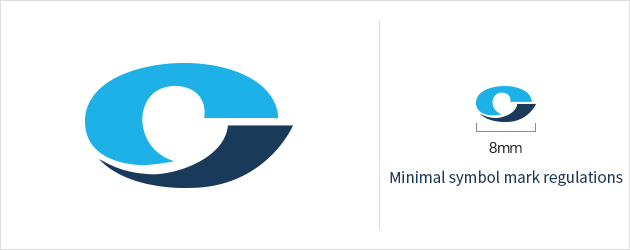
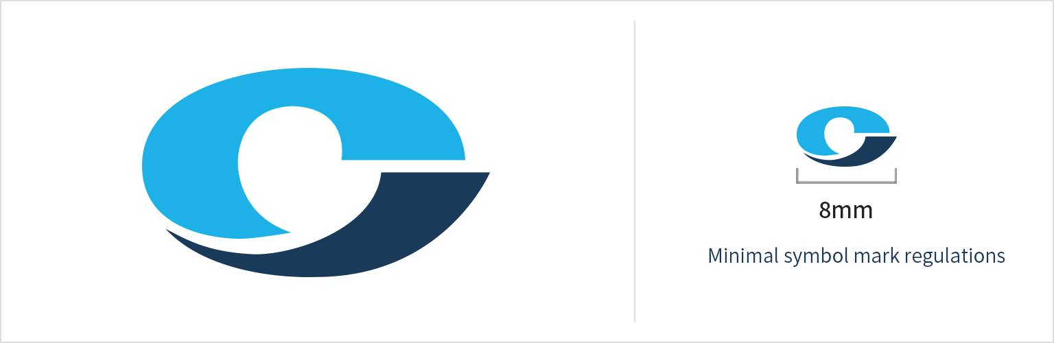
Corporate Symbol Mark 코퍼레이트 심볼마크 Download
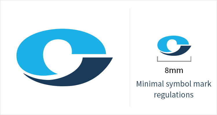
COSMO’s symbol mark focuses on expressing a transparent, responsible, and customer-oriented mind and the world-oriented will to change anew and leap into the globalized world. COSMO’s initial C was designed in balance to symbolically express the corporate philosophy towards internal and external harmony, while the dynamic curves reflects COSMO’s future of permanent development through continuous innovation. Light blue and dark blue used in the mark illuminates the image of a smart and eco-friendly company.
-
Light Blue
C 72 M 14 Y 5 K 0
R 0 G 178 B 235
#00B2EB
-
Dark Blue
C 100 M 86 Y 52 K 20
R 0 G 53 B 87
#003557
Corporate Logotype (Korean, English) 코퍼레이트 로고 (국문,영문) Download
Logotype is used to express the company’s unique identity, and alongside the symbol mark, is an essential factor that composes the core of COSMO’s corporate image formation. Logotype was developed with a modern sense and excluded decorative elements to stress the harmony with the symbol mark. As logotype is adjusted in proportion to the shape of each font, no one shall change the font, thickness, proportion, and other elements in their own discretion.